
Enumeration and Graph
Let us consider the following example.
Exemple : Medics
En France en 1981, la répartition des médecins généralistes par tranches d'honoraires est la suivante :
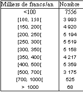
On admettra que les honoraires les plus élèves sont inférieurs à 1200 milliers de francs par an.
The problem is to find out the best possible graphical representation for this table. (note: the term “best” has several level and definitions, the first will be readability, but do try to encompass other attributes such as comparability, message, etc...).
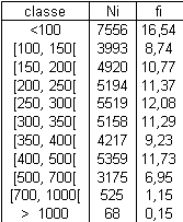
First, let us reproduce the original table, adding the frequencies for each class. It shows like this:
An immediate graphical representation comes to mind: the pie chart, where the angle of each sector represent the frequency (French speakers use the term “camembert” for this).
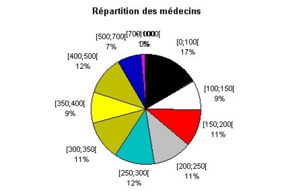
This kind of chart provides a good representation of how the classes are distributed, however it does not allow an easy comparison of values.
Consequently, it is not necessarily wise to use such chart for quantitative variables.
On the other hand, pie charts are generally good candidates for meaningful charts with qualitative variables.
Indeed, if we look back at the ski resort example used previously.
Exemple :
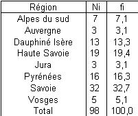
The distribution of ski resorts in France by location (here the location we will determined by regional administrative level the resort belongs to).
We have the below table:
from which we obtain the following pie chart:
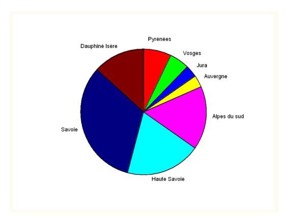
The comparison of both pie charts demonstrates the relevance of pie chart use for the ski resorts, which is not the case for the physicians example. Although pie charts are widely (ab)used in daily corporate life, do yourself a favour by using them with judgement.


